I Generated 50 Websites With AI. They Were All the Same Website.
Looking for a Lovable alternative? Why every AI website builder ships the same purple gradient and three feature cards — and what it takes to actually design.
Why we stopped building another code generator and built something that actually designs.
Last year I did something stupid.
I sat down and generated fifty landing pages. Different tools, different prompts, different industries. A SaaS dashboard. A yoga studio. A fintech app. A coffee roaster. A B2B analytics platform.
Fifty completely different businesses.
Then I put the screenshots side by side.
And I felt sick.
They were the same website
Not similar. The same.
Purple-to-blue gradient hero. Headline, subheadline, two buttons — one filled, one outlined. Scroll down: three feature cards, rounded corners, a little icon on top of each. Scroll down: pricing table, middle column highlighted, "Most Popular" badge. Scroll down: testimonials with avatars of people who don't exist. Footer, four columns of links.
The coffee roaster and the fintech app had the same layout.
I had prompted for a warm, artisanal, hand-roasted-in-small-batches coffee brand. I got a purple gradient and three feature cards.
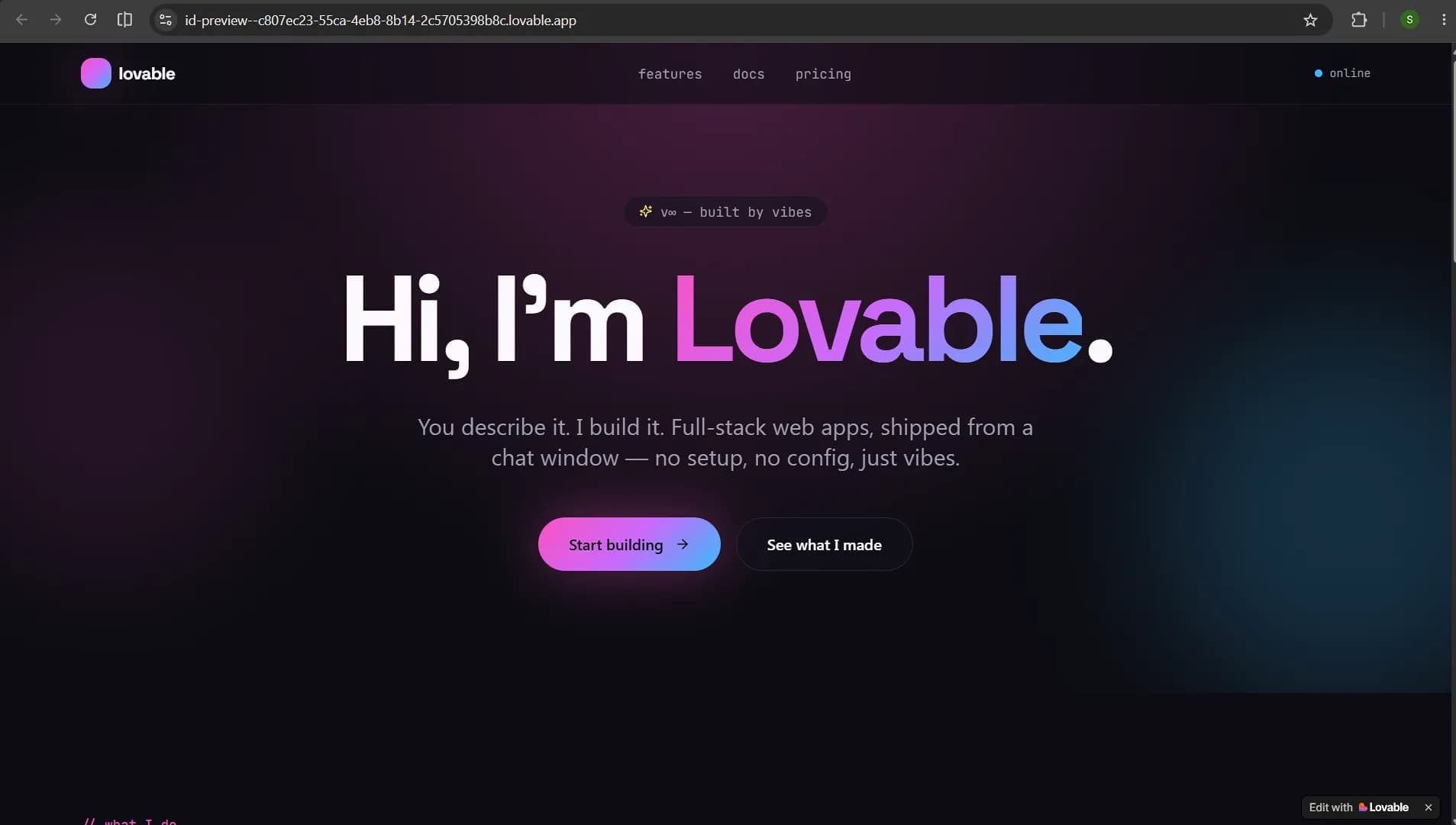 That's when it clicked. These tools aren't designing anything. They're filling in a template they can't see.
Why every AI builder produces the same site
Here's what's actually happening under the hood, and once you see it you can't unsee it.
An LLM generating a website is doing next-token prediction. It's asking, over and over: given everything I've seen, what's the most likely next thing?
The most likely hero section is a centered headline with a gradient. The most likely next section is three feature cards. The most likely thing after that is pricing.
The model isn't choosing that layout. It's falling into it.
It's the statistical center of every website ever scraped. It's the mathematical average of the internet. And the average of everything is, by definition, generic.
So when a tool says "we generate beautiful websites," what it means is "we generate the most probable website." Those are opposite things. Beautiful is unlikely. That's what makes it beautiful.
This is AI slop design, and it's not a bug in these tools. It's what they are.
The part that made it worse
Here's what really got me.
You can't prompt your way out of it.
I tried. I wrote prompts like "make it bold and unconventional, avoid generic layouts, use asymmetry, break the grid."
Purple gradient. Three cards. Pricing table.
I got more specific. "No gradient hero. No three-column feature section. Use a bento grid layout."
It gave me three cards in a slightly different arrangement and called it a bento grid.
Because the design isn't a variable you control. It's baked into how the thing generates. You're not steering — you're nudging a landslide.
And every hour you spend fighting it is an hour you're not shipping.
So we stopped trying to fix the prompt
We built Orlume around one idea:
 Design has to be its own step. Not a side effect of writing code.
When Orlume generates a site, it doesn't go straight to React. It designs first — deliberately, as a separate pass:
- What's the actual personality of this brand? Warm and artisanal, or sharp and technical?
- What should the eye hit first, second, third?
- What's the type scale, and does it have real contrast, or is everything mushy 16px-to-24px?
- What's the spacing rhythm?
- Where does this layout break the pattern so it doesn't read as generated?
Then it writes the code to build that.
Sounds like a small reordering. It changes everything about the output.
The test I use: generate the same prompt twice.
In a code-first tool, you get the same site with different words in it.
In Orlume, you get two genuinely different-looking sites — because the design pass made real choices, and real choices could have gone another way.
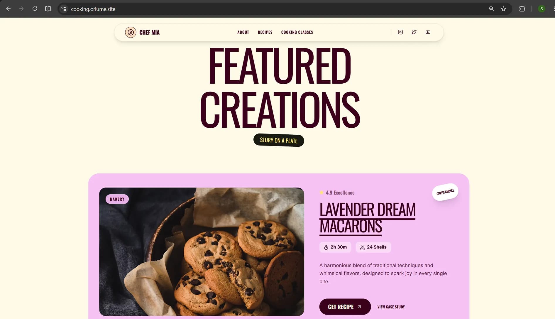
Think Mode
Some pages need to be right. Not fast — right.
Your actual landing page. The portfolio someone's judging you on. The site behind money you're spending on ads.
Think Mode is for those. Turn it on and the system spends real reasoning effort on design decisions before writing a single line:
- Where should the eye land, and what carries it down the page?
- What does this brand's personality look like in spacing, weight, and color?
- What's the one section that should break rhythm so the page doesn't feel flat?
- Does the type scale have genuine contrast?
It's slower. That's the entire point. You're buying judgment, and judgment takes time.
The difference between fast generation and Think Mode is the difference between a site that works and a site someone screenshots.
Dream Mode
This is the one I'd rather show you than describe.
Two things separate a site that looks designed from a site that looks generated. Both normally cost real money and real time.
Bento grids. The layout language every good 2025-2026 site uses. Cells of different sizes, weighted so your eye moves in a deliberate path.
AI builders fail at these consistently, and the reason is interesting: a bento grid requires deciding which cell deserves to be big. That's a hierarchy judgment. There's no statistically likely answer. So models default to equal-sized cards in a row — which is a grid, technically, and completely dead visually.
Product videos. Not a grey rectangle saying "your video here." An actual generated, embedded video in your site.
Both of those. One click.
The two things you'd normally hire a designer and a video editor for — ₹50,000 to ₹2,00,000, and two to three weeks of back-and-forth.
That's Dream Mode.
Okay — where Lovable is genuinely ahead
 I'm a co-founder here, so take everything above with the appropriate amount of salt. Let me be straight about where we're not winning.
Lovable has been around longer. They have deeper integrations, more mature multi-page logic, and a much bigger community — which genuinely matters when you're stuck at 2am and need someone to have hit your bug already.
If you're building something logic-heavy with complex state across many pages, they're ahead of us today. We're catching up, but I'm not going to claim we're there.
We're not trying to be a better Lovable. We're betting on a different problem entirely.
They're solving can AI write my app. That's nearly solved — every tool will do it within a year, and it'll be table stakes.
We're solving can AI make something that doesn't look like AI made it. Nobody's solved that. It's not a correctness problem — there's no test suite for "this looks good." It needs taste, and taste is exactly what models are worst at.
Quick comparison
Orlume
- Design-first generation — layout is decided, not defaulted
- Think Mode for deliberate design reasoning
- Dream Mode: bento grids + product video, one click
- High layout variance between generations
- Best for: landing pages, portfolios, product sites, anything you're judged on visually
Lovable
- Code-first generation, fast and reliable
- More mature integrations and multi-page logic
- Much larger community
- Best for: logic-heavy apps where you want developer control
The honest recommendation
Try both. Same prompt, both tools, screenshots side by side.
I'm biased and you should assume I am. But this specific comparison isn't a matter of opinion — you'll see the difference in about ten seconds, or you won't. If you don't, use Lovable. Genuinely.
What I'd ask is that you actually run the test rather than taking my word for it.
Why this matters more than it sounds
Design isn't decoration. It's the first thing anyone judges you on, and they do it in about 50 milliseconds — before they read one word of your copy.
When your site looks generated, it says something you didn't intend: I didn't care enough to make this mine.
Your product might be excellent. Your competitor's might be worse. But if their site looks designed and yours looks like it came out of a machine, you lost before the comparison started.
Every AI builder can write your code now. That race is over.
The one that's still open is whether the thing that comes out has any taste at all.
That's what we're building.
FAQ: Lovable alternatives
What is the best Lovable alternative?
Depends on what you're building. Lovable is stronger on multi-page logic and integrations. Orlume focuses on design quality — hierarchy, real layouts, and sites that don't look generated.
Is there a free Lovable alternative?
Yes. Orlume has a free tier...
Why do AI website builders all look the same?
Because they predict the most likely layout, which is the statistical average of every site ever scraped...
I'm shubham, co-founder of Orlume. Everything about Lovable reflects our own testing in early 2026 — they ship fast, so check their current docs. If I've gotten something wrong, tell me and I'll fix it.

Build something that doesn't look AI-made
Orlume designs before it codes: real hierarchy, real layouts, live in minutes.
Try Orlume free